Prototype Demo Video
Project Duration:
5 Weeks
5 Weeks
The Objective:
Humanize a household appliance and design a touchscreen interface for the appliance that has an iPhone-style touchscreen (with multi-touch) and no physical buttons.
Humanize a household appliance and design a touchscreen interface for the appliance that has an iPhone-style touchscreen (with multi-touch) and no physical buttons.
The Approach:
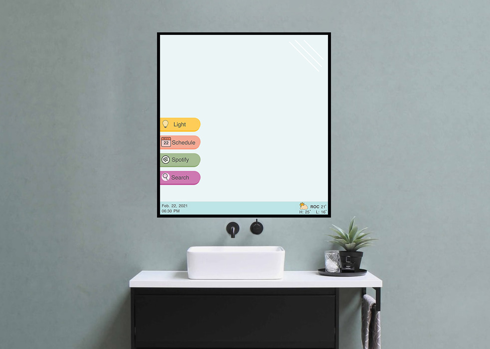
The household appliance that I selected was the bathroom mirror since it's one of the first appliances that a person might use. For this project, I wanted to find a way to make the mirror a more efficient and helpful appliance while the user is either getting ready for the day or ending the night.
Process Work
hi
Discovery:
Compre
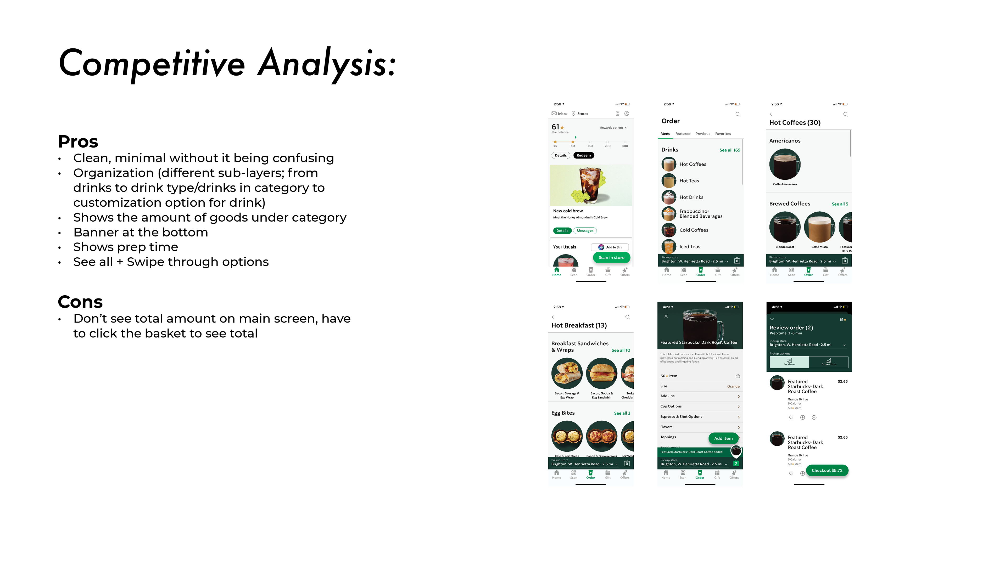
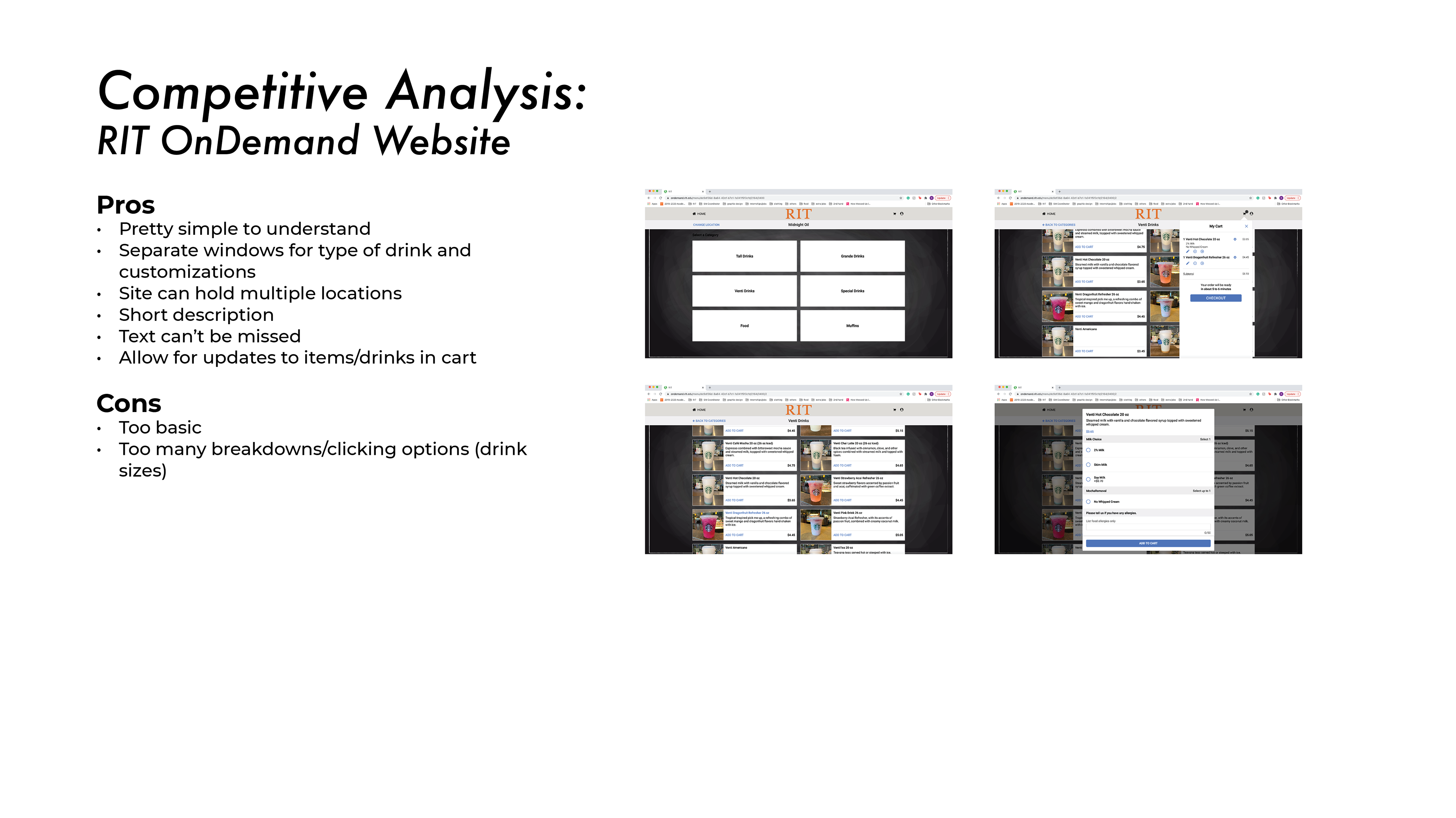
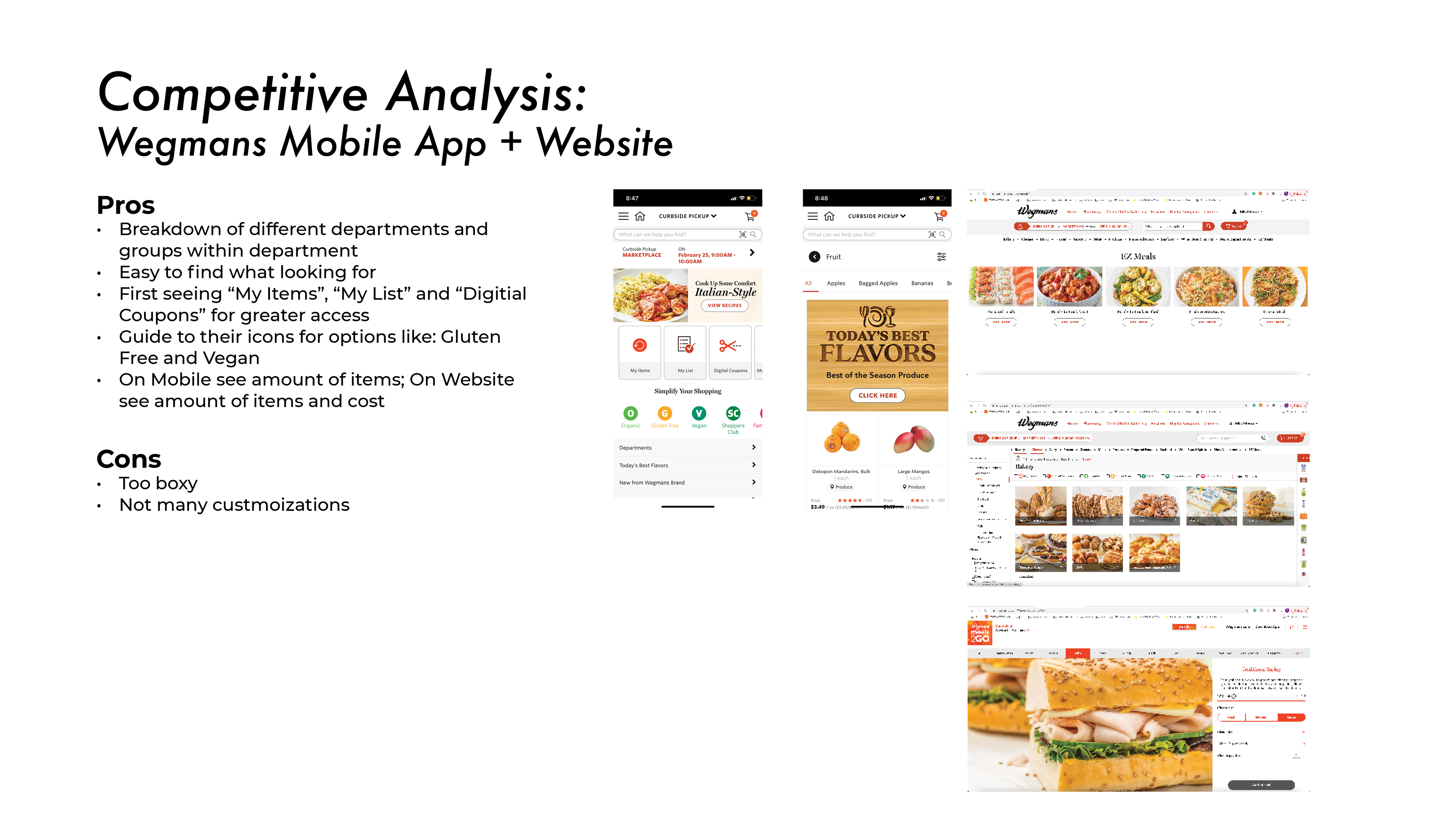
(Wegmans, Starbucks, RIT OnDemand)
Compre
(Wegmans, Starbucks, RIT OnDemand)
Qualitative Interviews
Key Findings:
1. Used ordering app for convenience
2. Look for customization and a range of offerings
3. Helpful to look back at previous orders
4. Ingredient/Nutrition lists for allergies
5. Organization by category
Key Findings:
1. Used ordering app for convenience
2. Look for customization and a range of offerings
3. Helpful to look back at previous orders
4. Ingredient/Nutrition lists for allergies
5. Organization by category
Define:
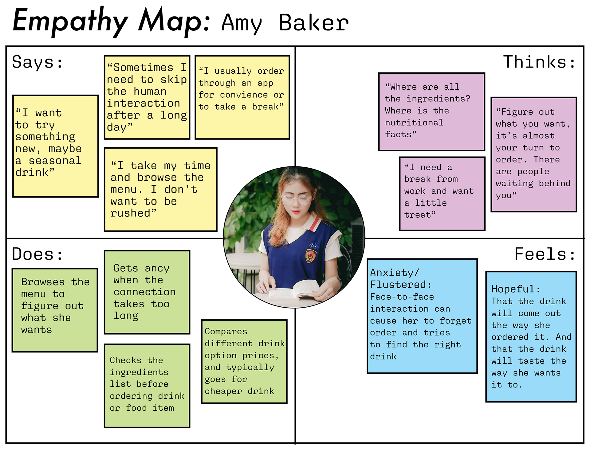
Persona + Empathy Maps
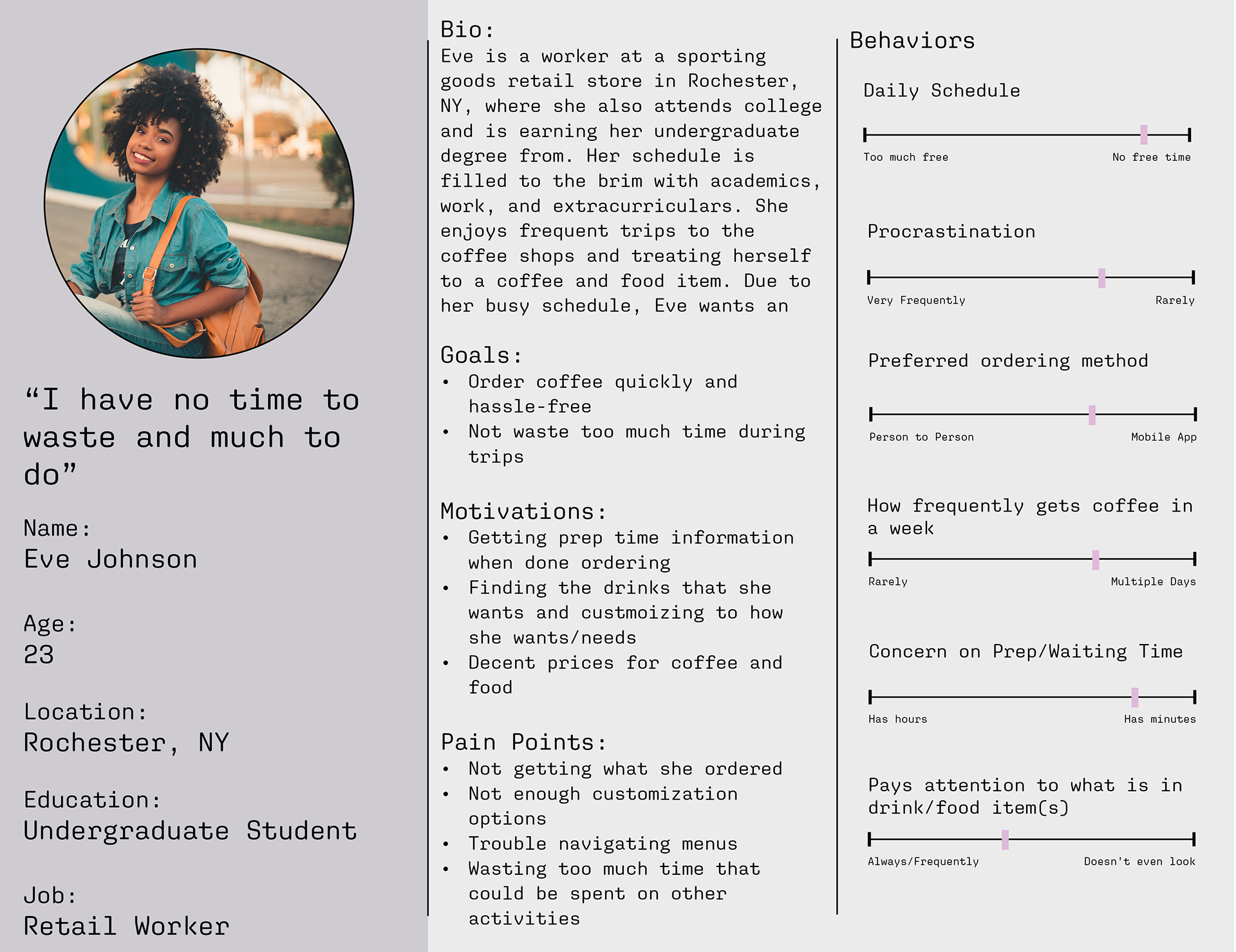
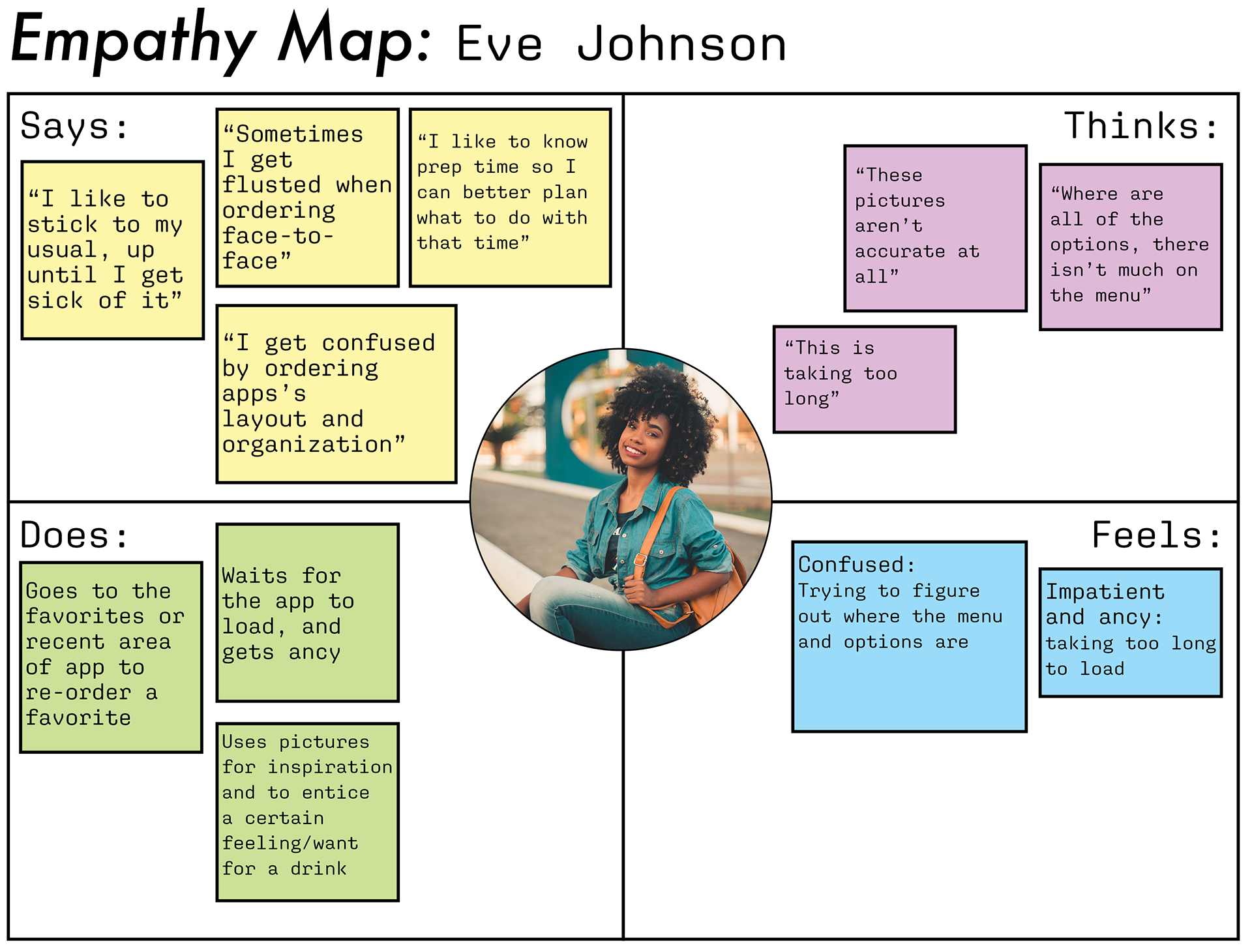
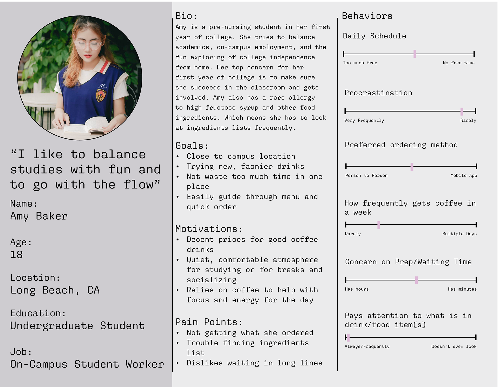
After interviewing people that have used and that will use drink ordering systems, I created two personas and empathy maps to help identify the target audiences. In order to design effectively, it was important to empathize and understand the user better. Since convenience was integral to using an ordering app, there are two busy students. Each student with different needs and frustrations when it comes to ordering.
Ideate:
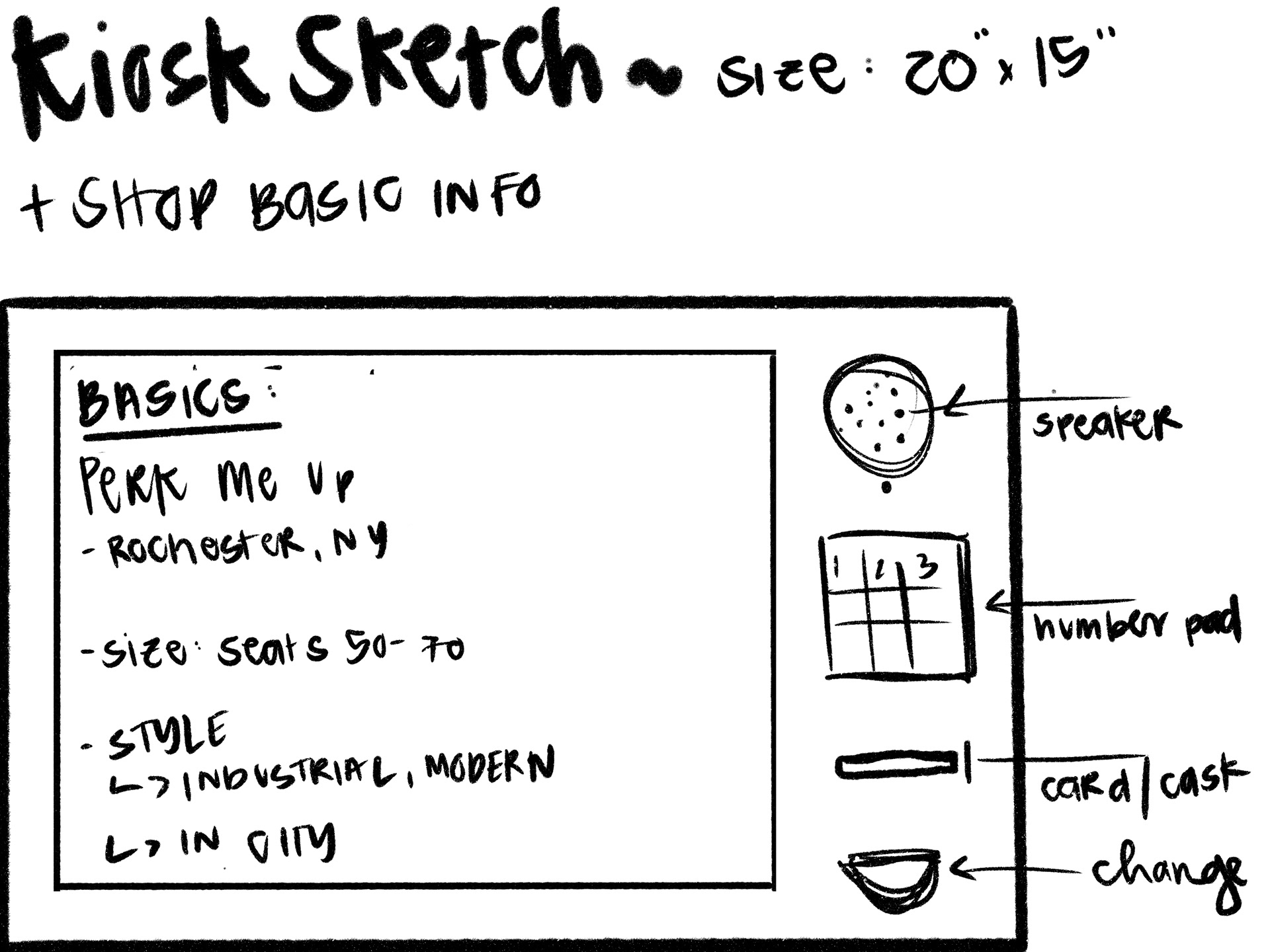
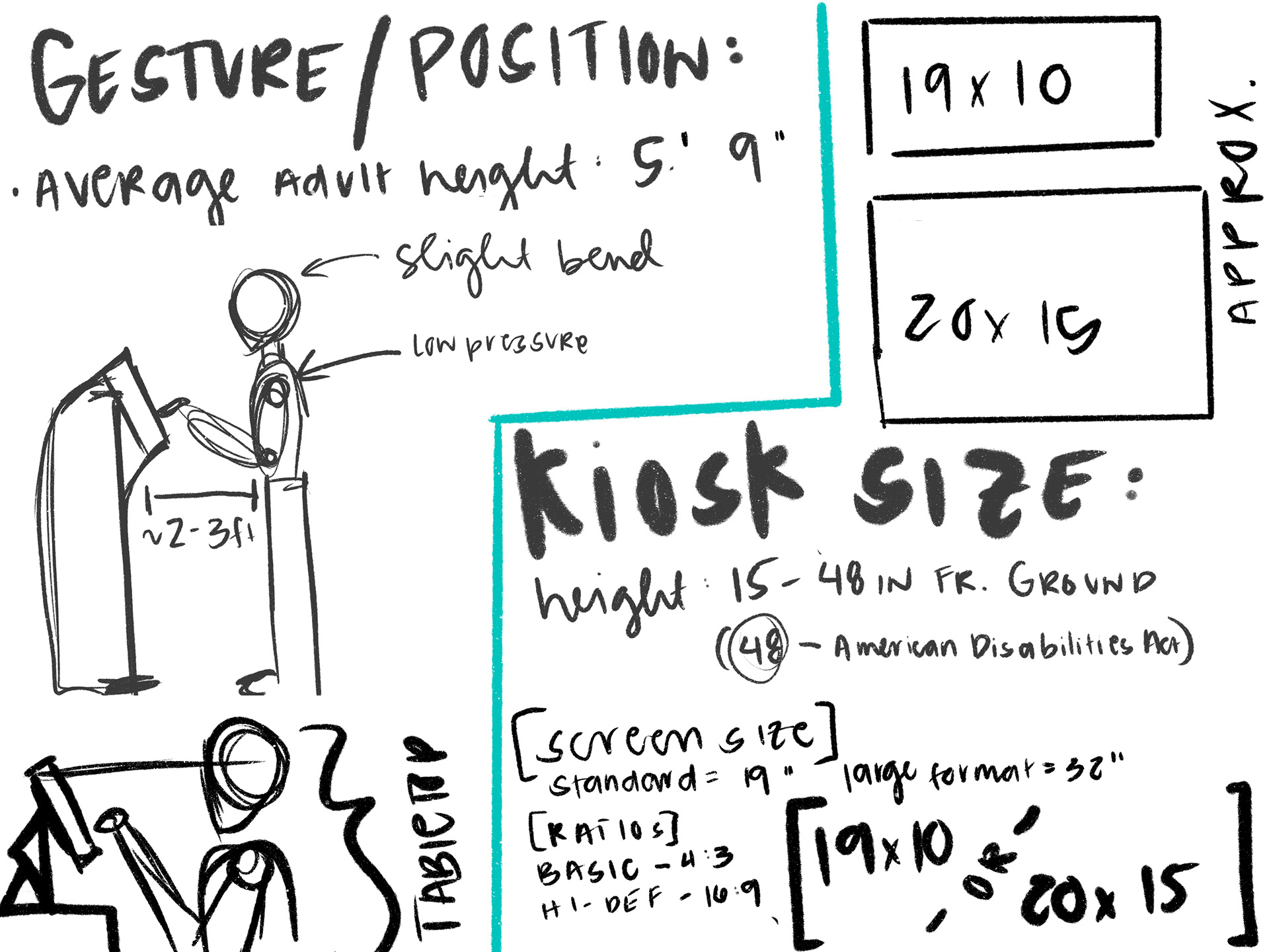
Screen + Device Research
If this on-campus coffee shop were to have a kiosk, this would likely mean that they would have cheaper kiosk options. Leading to a kiosk the size of an iPad, which is easy to come by and shouldn't be too difficult to maintain.
Screen + Device Research
If this on-campus coffee shop were to have a kiosk, this would likely mean that they would have cheaper kiosk options. Leading to a kiosk the size of an iPad, which is easy to come by and shouldn't be too difficult to maintain.
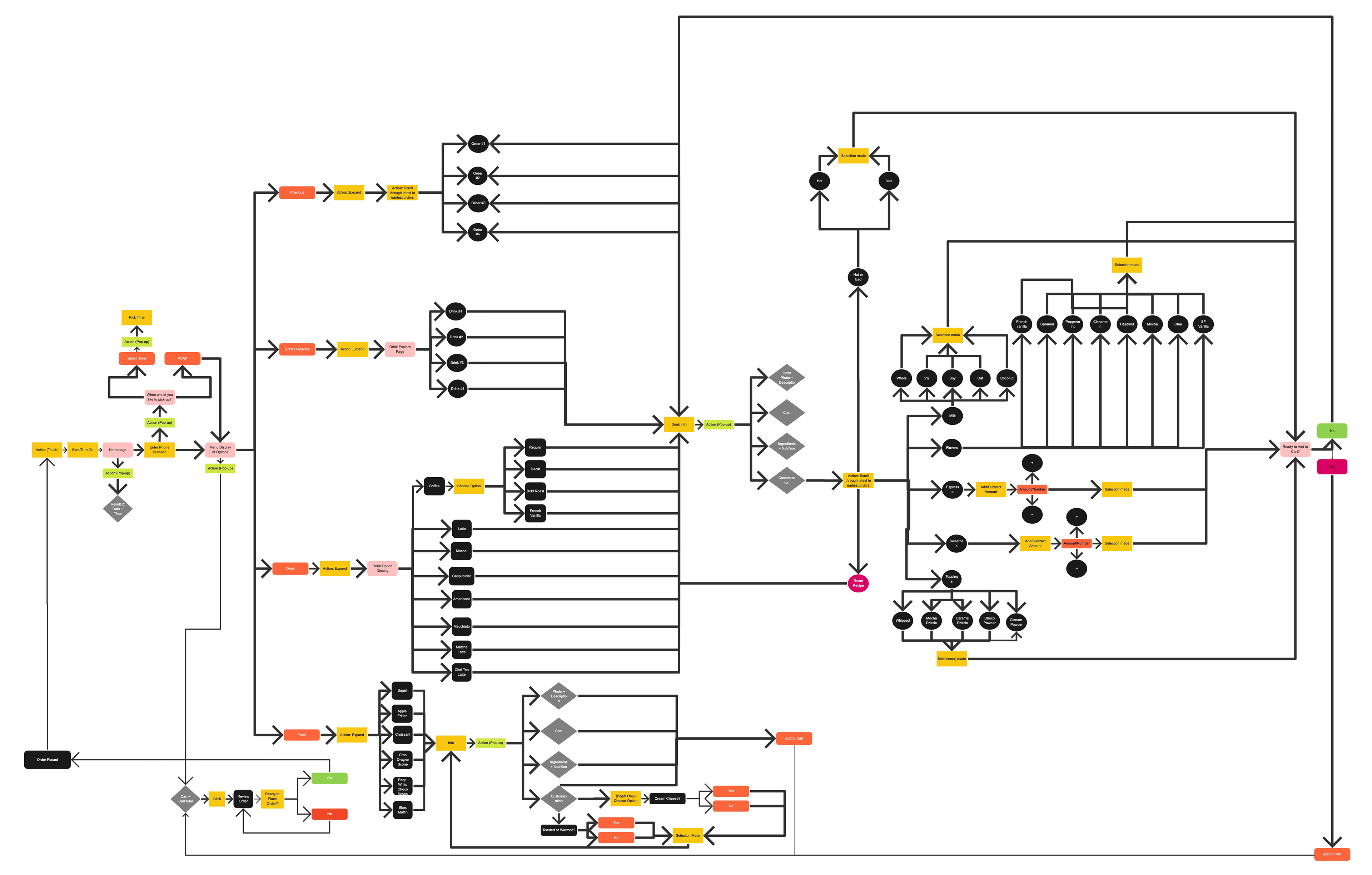
User Flow
This was helpful to track how the user navigates the kiosk system. There are a few questions that come to mind. Were there too many steps? What are the actions needed? Is that too many actions?
This was helpful to track how the user navigates the kiosk system. There are a few questions that come to mind. Were there too many steps? What are the actions needed? Is that too many actions?
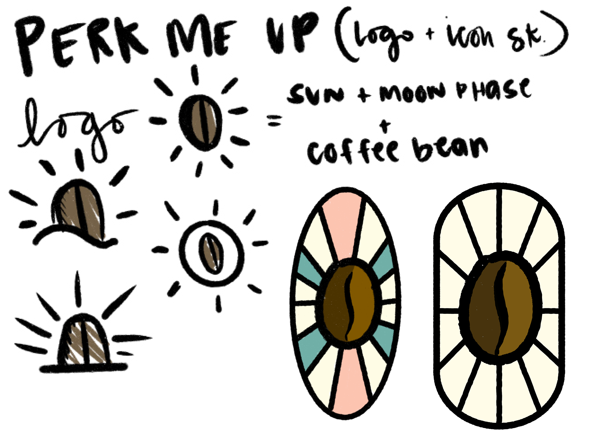
Branding
To better understand the user's process of using the food and drink ordering system, I ask a few peers to answer
some questions and to show me how they would use an
app to order.
To better understand the user's process of using the food and drink ordering system, I ask a few peers to answer
some questions and to show me how they would use an
app to order.
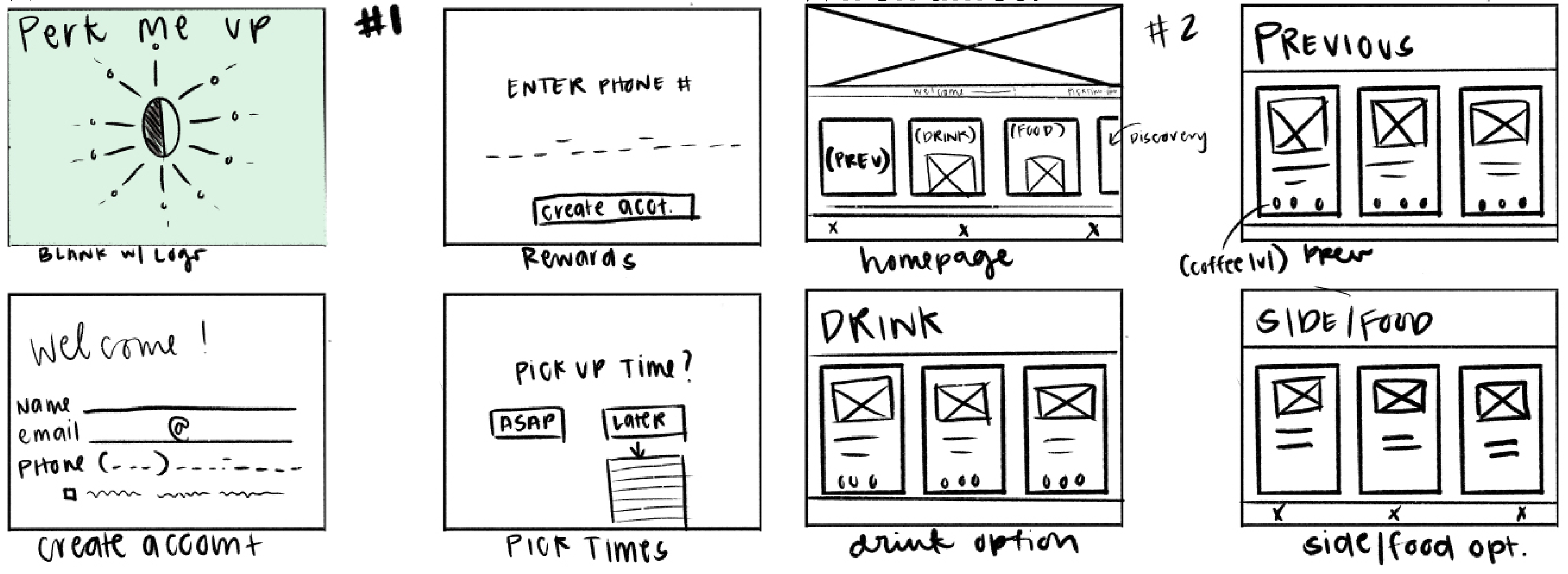
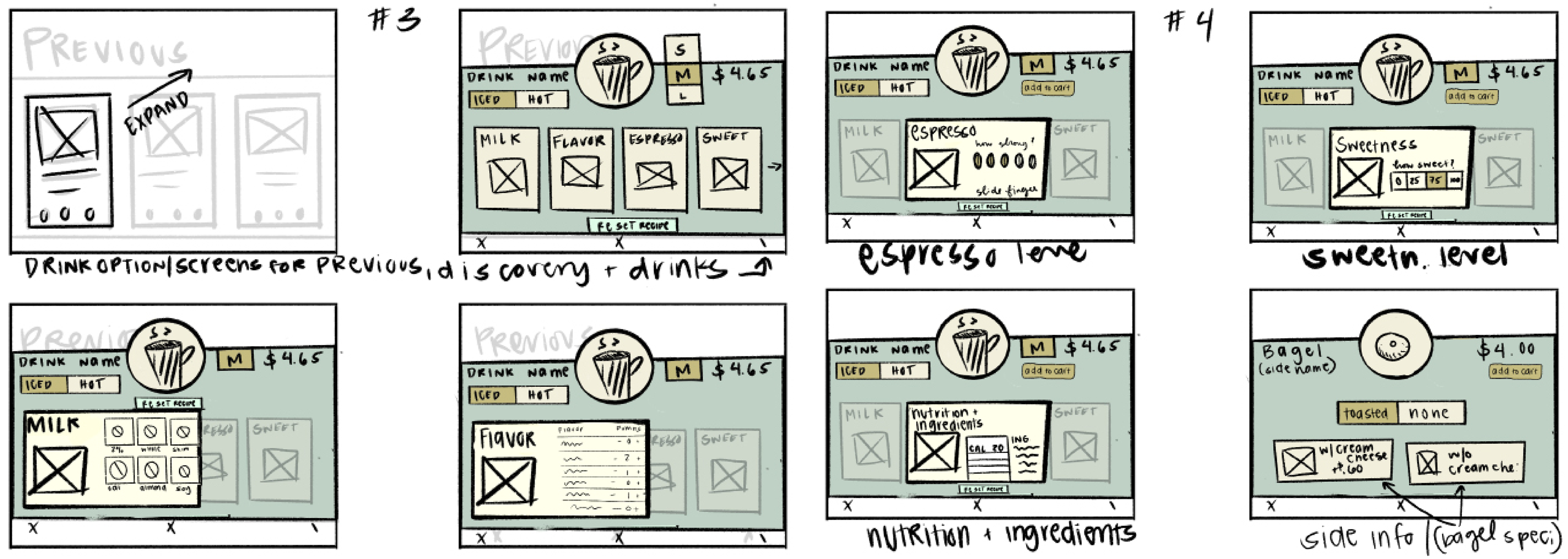
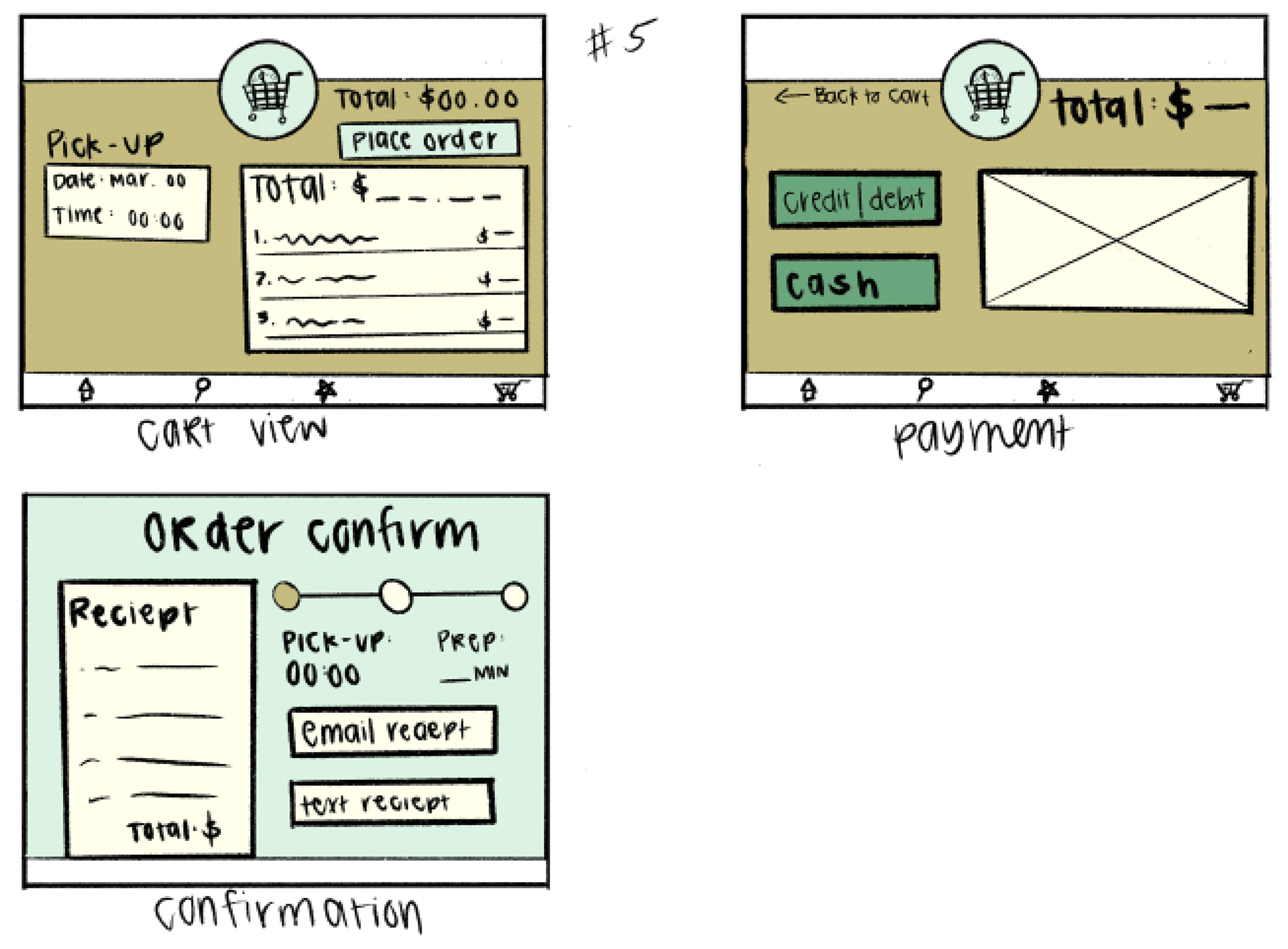
Wireframes
To gain a better understanding of where information should go. It took a couple of tries to figure out and optimize the layout to fix the number of options or customizations a user would wish for.
To gain a better understanding of where information should go. It took a couple of tries to figure out and optimize the layout to fix the number of options or customizations a user would wish for.
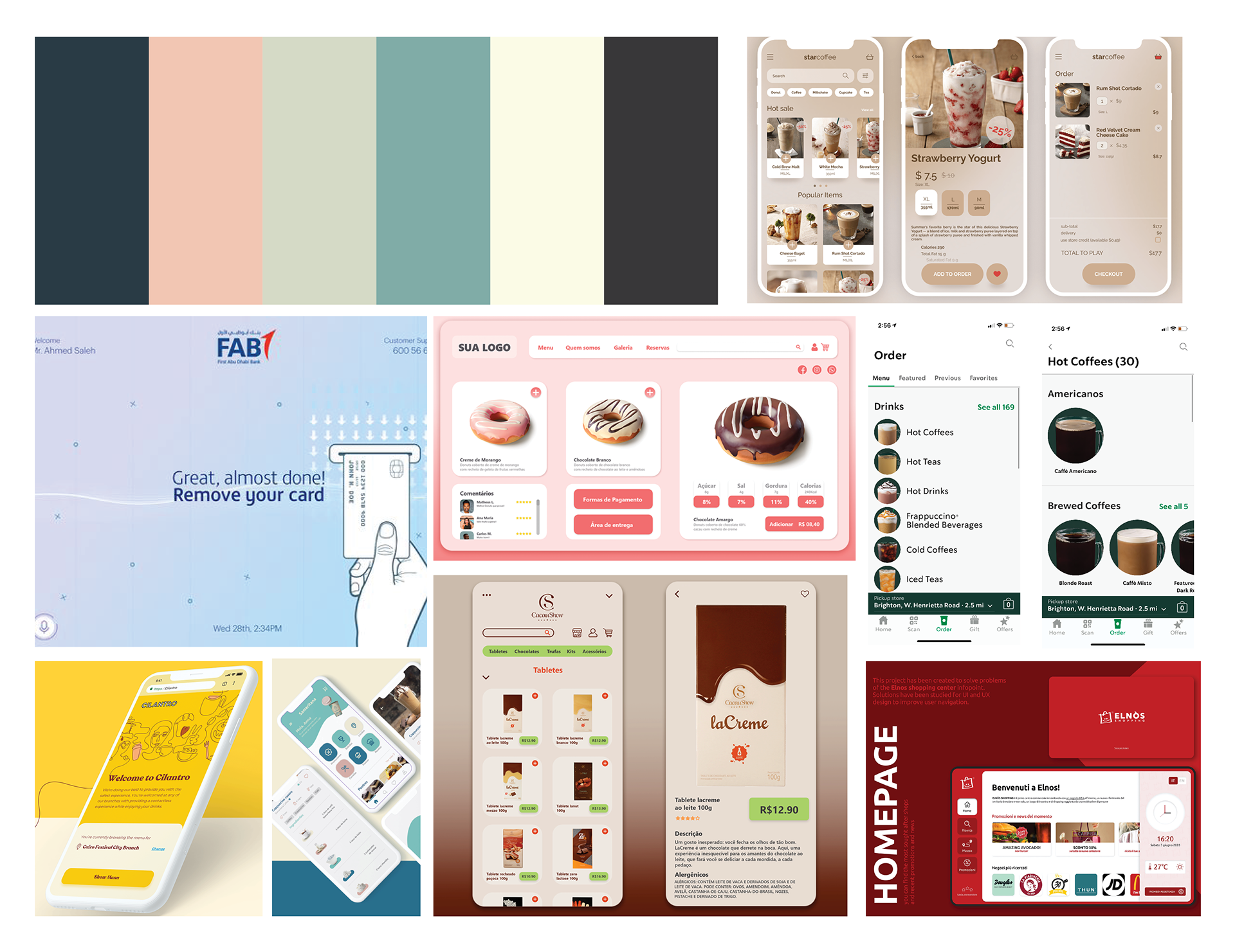
Branding Moodboard
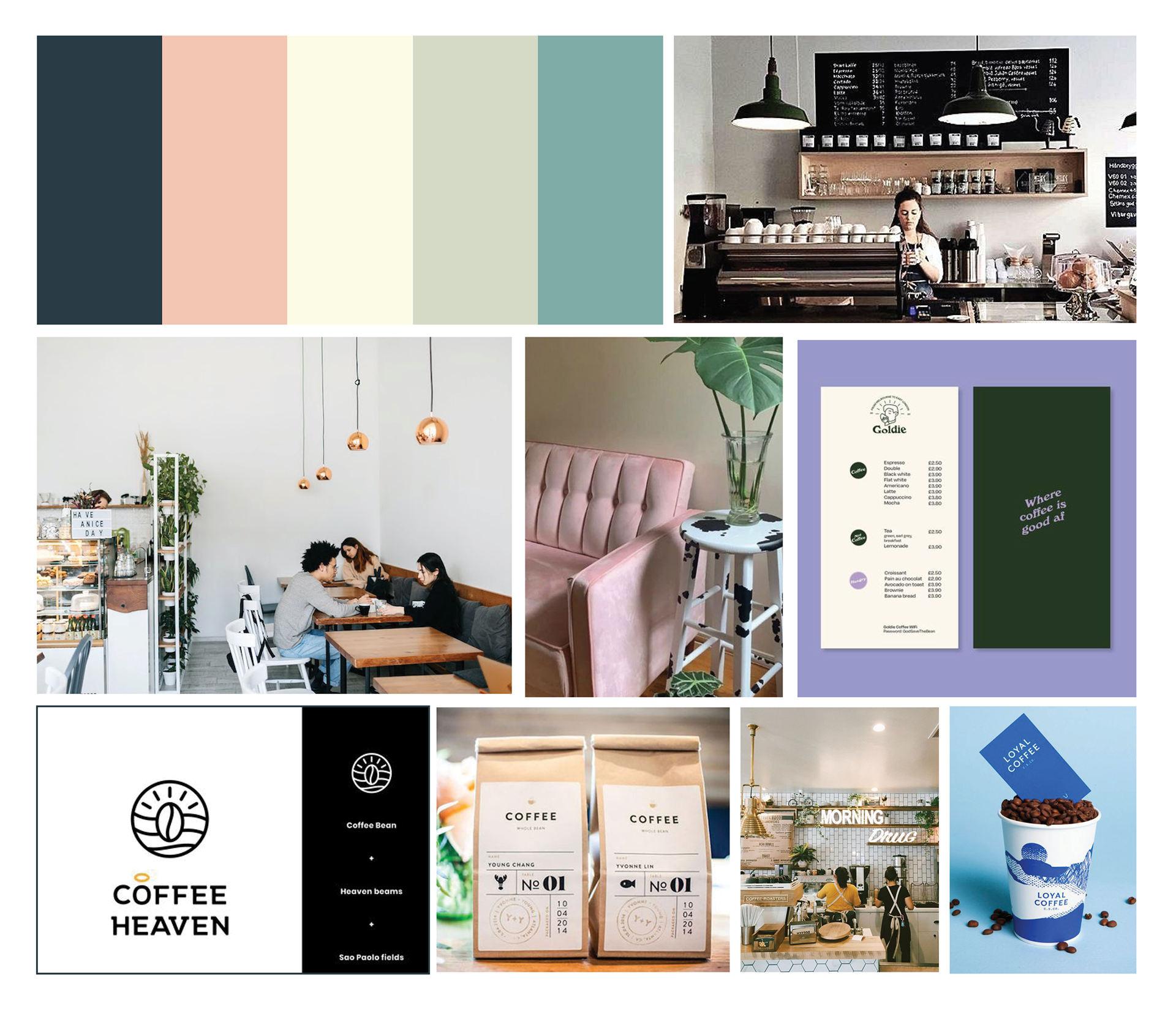
Store Moodboard - Getting a feel for the environment of the coffee shop.
